
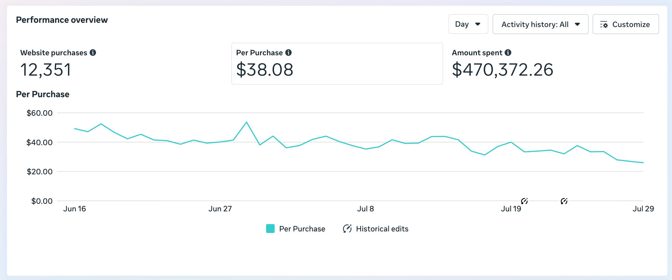
Surely this is the most beautiful chart I’ve ever seen in our ad account.
This is our main scaling campaign and you can see the CPA going down and to the right like a ski slope as time progresses.
It is a very simple set up that I will explain below. And there are a few key decisions we’ve made in it that have (in my opinion) helped us achieve this.
